Industry
Social Impact
Humanitarian Sector
Role
Ux Designer
Rebranding
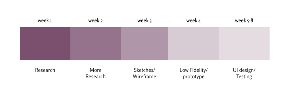
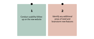
Timeline
February-April 2025
Tools Used
Figma
Adobe Illustrator
The Product:
This student project involved redesigning The Zebra Dreaming Foundation's digital platform to enhance trust, engagement, and alignment with its mission in the eyes of donors.
My Role:
I worked as an end-to-end UX/UI Designer, responsible for the entire design process — from user research to the redesign and delivery of the final digital interface.My main focus was on improving the visual experience and user interaction, emphasizing emotional design, intuitive navigation, and creating a human-centered connection between donors and the cause.
The Problem
Donors often struggle to find a foundation that truly engages them while providing transparency and measurable impact. They may also feel limited by the lack of personalized and intuitive donation options that allow them to contribute in ways that best match their preferences — regardless of geographic barriers.
The solution
To create an engaging and transparent donation platform that builds trust and emotional connection with donors. The platform should offer personalized and intuitive ways to contribute, allowing users to choose how and where their support will be directed. It should also eliminate geographic barriers, enabling people to donate seamlessly from anywhere, at any time.
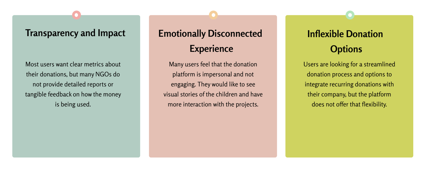
To understand the users, I conducted interviews and then transformed the insights into empathy maps to gain a deeper understanding of the target audience and their needs. I discovered that many users want clear, measurable updates on how their donations are making an impact. Many donors feel that traditional donation platforms lack engaging and immersive experiences. They seek a stronger emotional connection to the cause.
Donors expect a seamless, intuitive, and mobile-friendly donation process that allows them to contribute anytime, from anywhere. However, many existing donation websites are overwhelming and difficult to navigate—frustrating users and turning what should be a joyful experience into a challenging one, ultimately undermining the spirit of giving.
Donors crave transparency, emotion, and effortless giving.
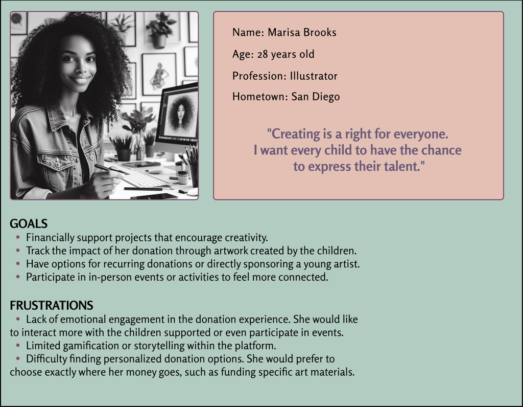
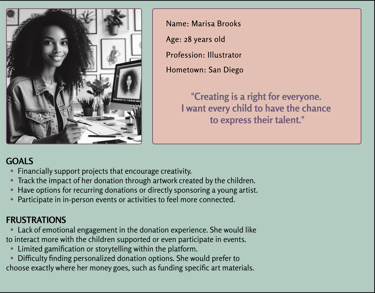
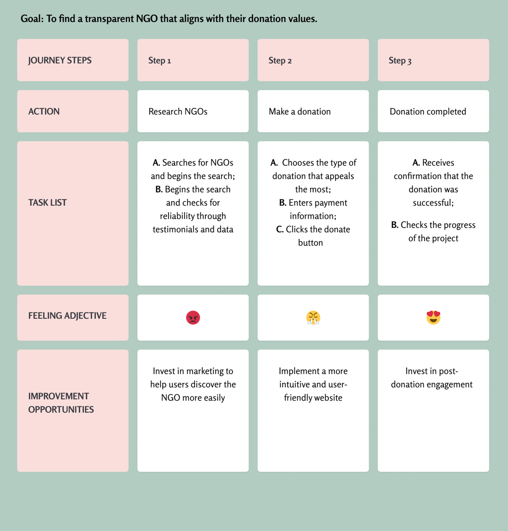
User journey map
I created a user journey map of Marisa's experience using the website to help identify pain points and opportunities for improvement.
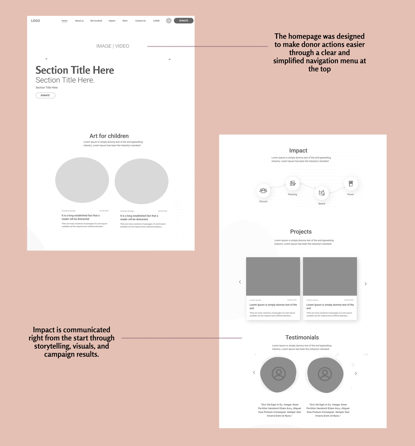
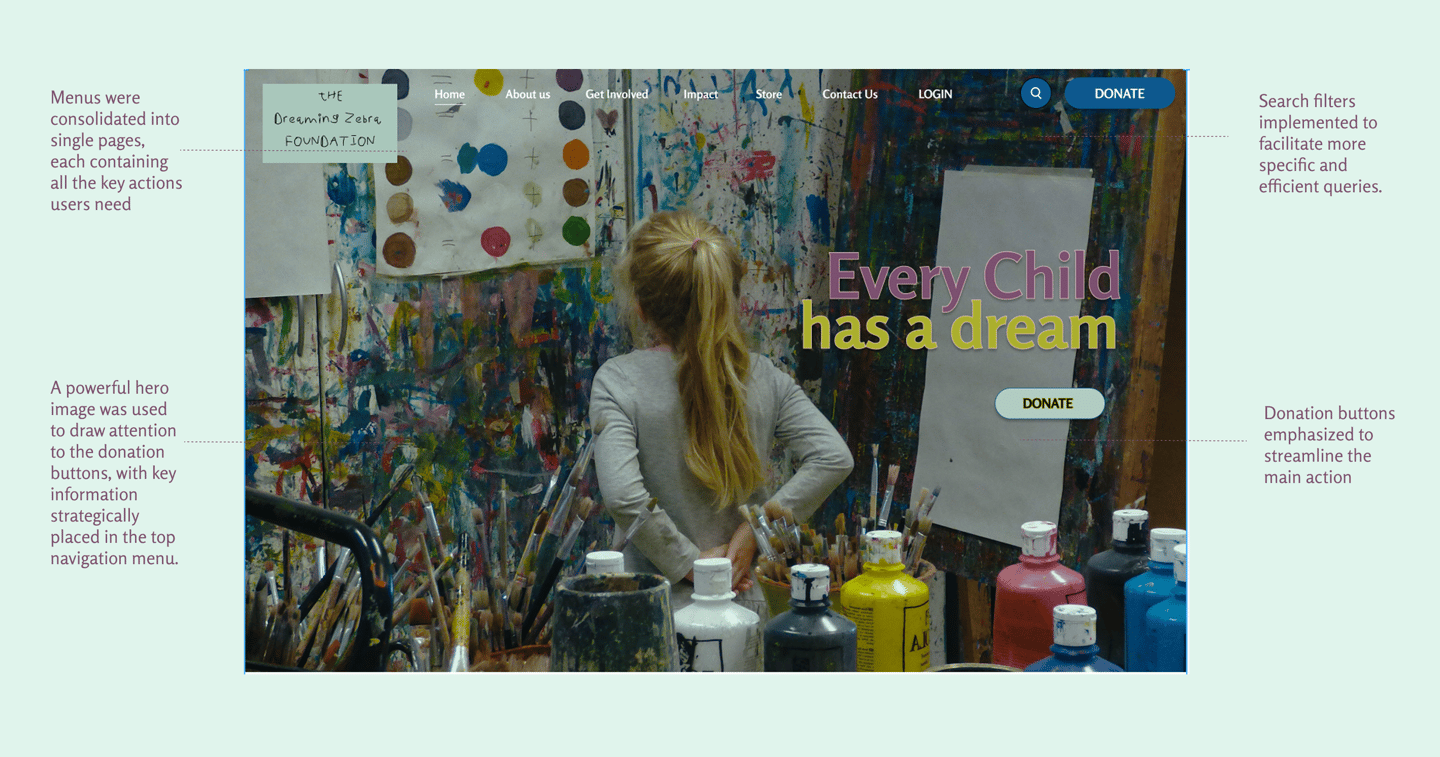
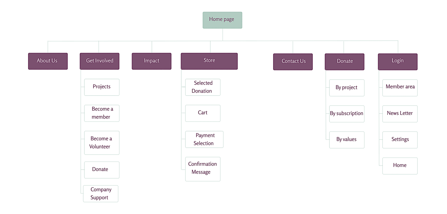
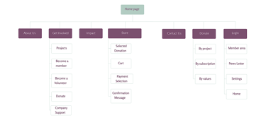
Navigation difficulty on the website was a primary pain point for users, so I used this insight to create a sitemap. My goal was to make strategic information architecture decisions that would improve the overall site navigation. The structure I designed was aimed at making everything simple and easy to use.
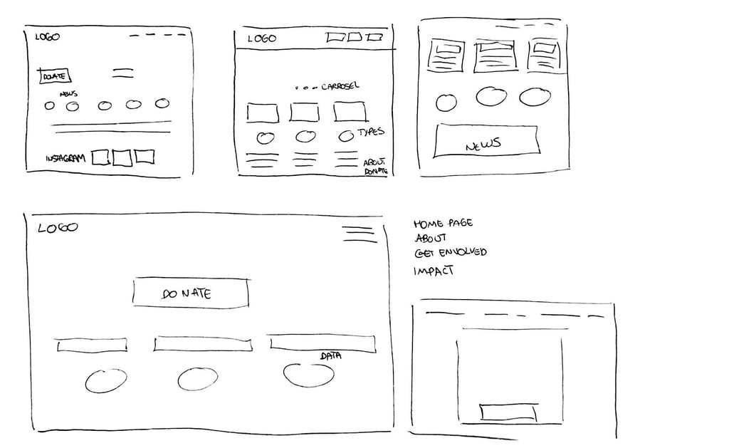
Next, I sketched paper wireframes for each screen of my app, keeping in mind the users’ pain points around navigation and the checkout flow. The paper wireframe variations of the home screen to the right focus on optimizing the navigation experience for users.
Shifting from paper to digital wireframes made it easier to understand how the redesign could help address user pain points and enhance the overall user experience. Prioritizing strategic button placement and the positioning of visual elements on the homepage was a key part of my approach.
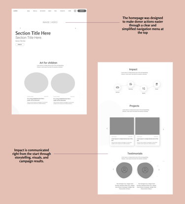
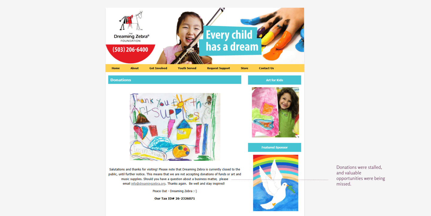
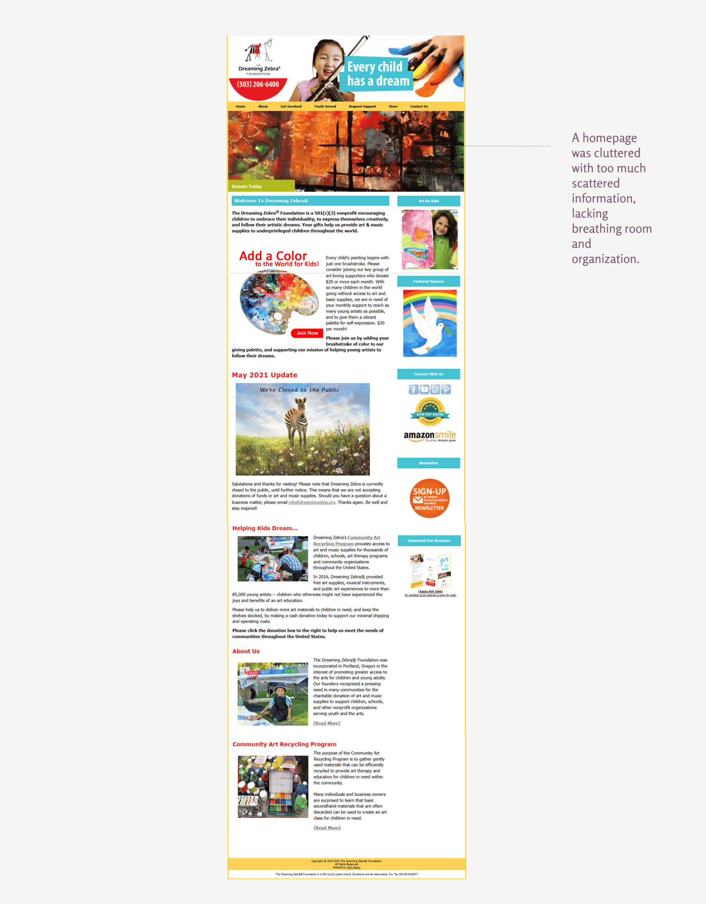
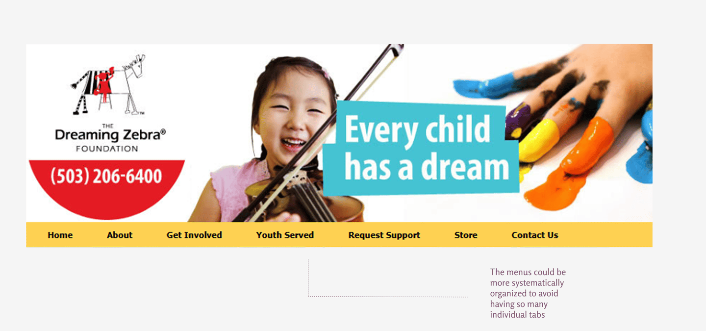
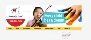
1- Confusing Menus:
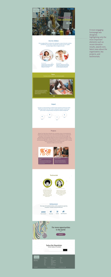
The menu was reorganized into more consistent and cohesive categories so donors could more easily find exactly what they are looking for. The resulting impact of the project is an important factor and needed to be highlighted in a dedicated section to ensure transparency and provide greater credibility and trust for both current and potential donors.
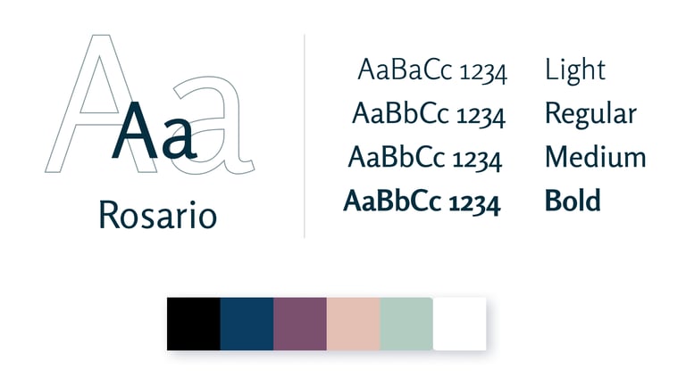
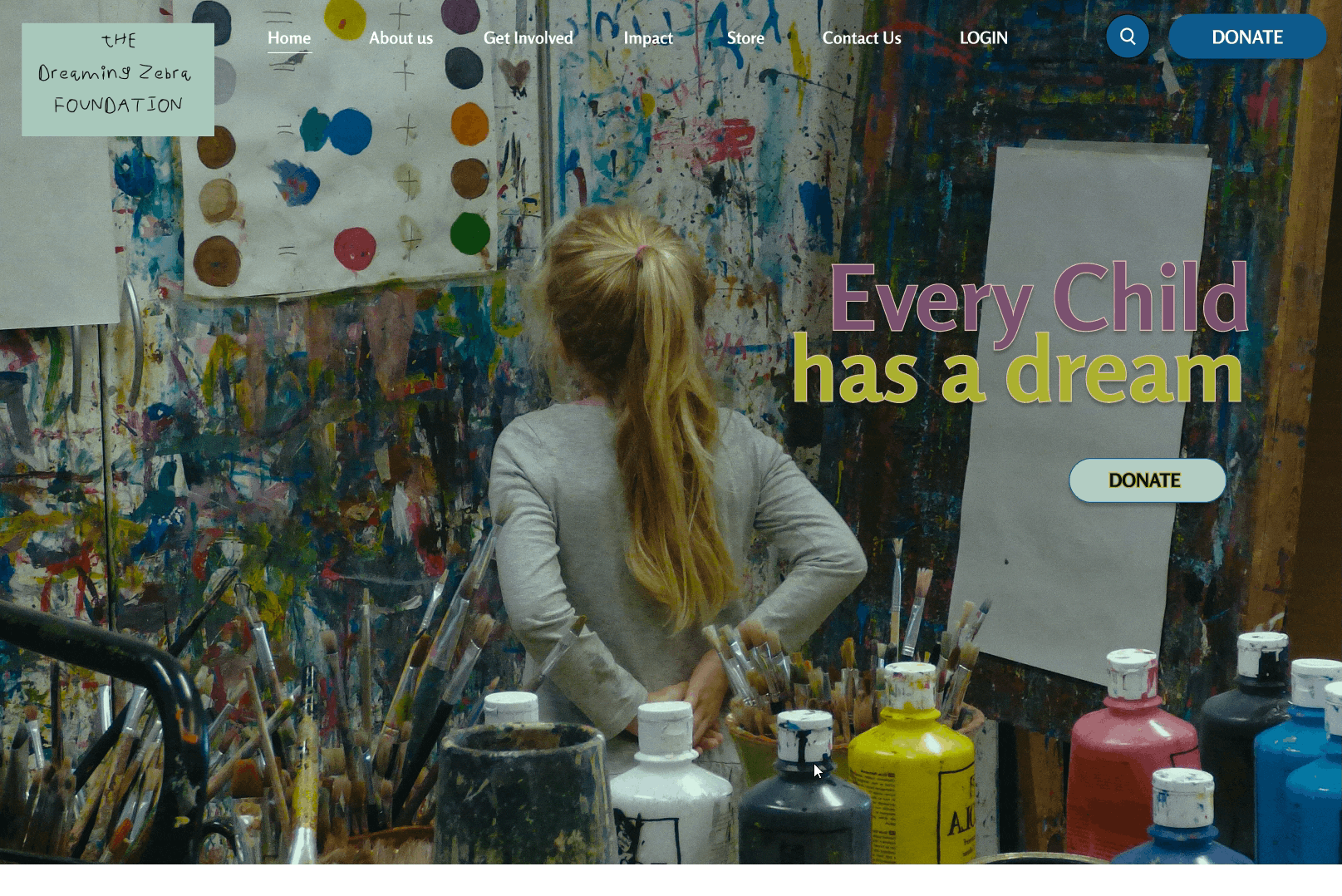
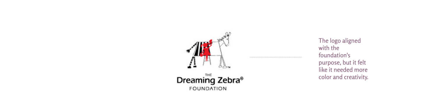
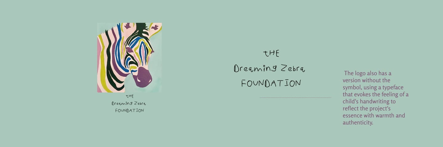
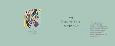
Redesign - Logo
Captivated by the artwork created by the children supported by the organization, I drew inspiration from one of their drawings. From there, I developed a vibrant and creative color palette that helped shape a more memorable and lively brand identity.
Impact:
Our target users shared that the design was intuitive to navigate, more engaging with the use of imagery, and demonstrated a clear visual hierarchy.
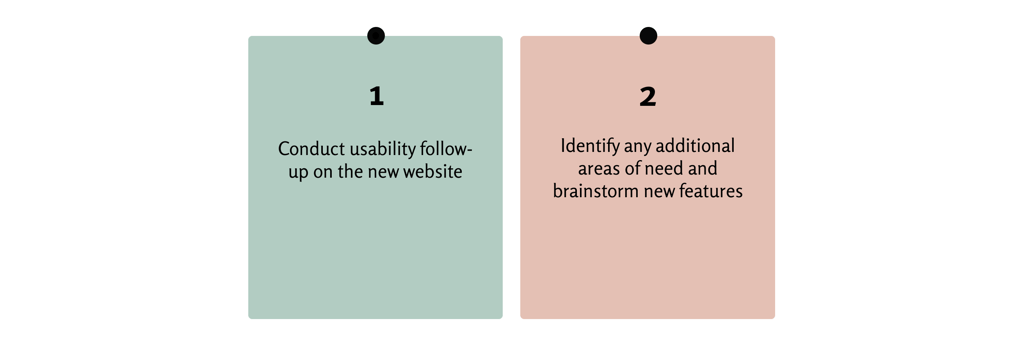
What I learned:
I learned that even a small design change can have a big impact on the user experience. The most important thing for me is always to focus on the user's real needs when creating design ideas and solutions.
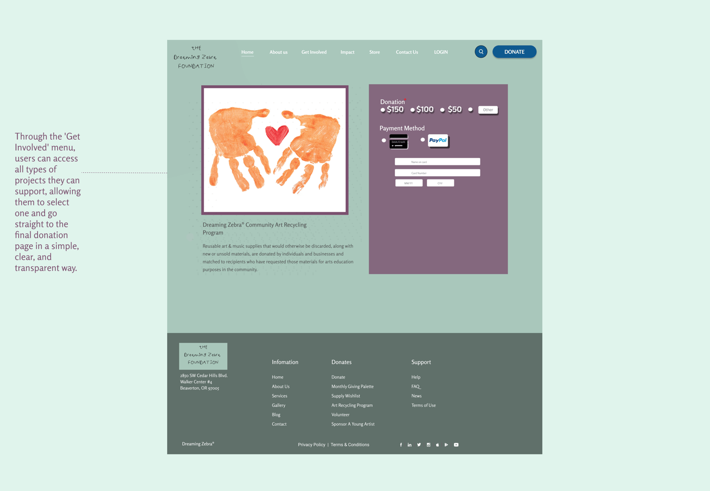
2- Donation Transparency
To make the donation process more accessible, a dedicated page was created for each project. This solution allows users to choose exactly which cause they want to support, strengthening their emotional connection to the impact they're helping to create
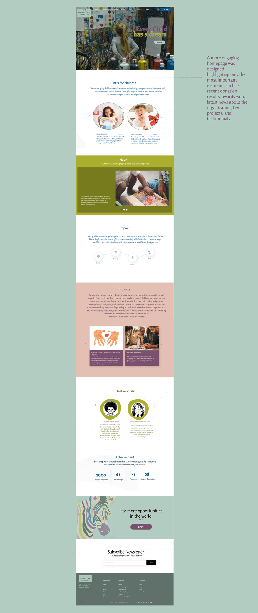
3- Inspiring Homepage
A new homepage was designed to better engage users by providing clear, relevant, and accessible information — helping them connect with the cause and navigate the platform more easily.