Industry
Mobility &
Sustainability Tech
Role
Ux Strategy
Ui Designer
Timeline
January-April 2025
Tools Used
Figma
Miro
Overview
Problem statement:
The lack of incentive and practicality in adopting bicycles as a daily means of transportation, making urban mobility less sustainable and accessible.
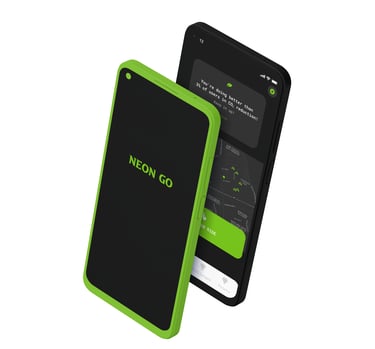
The product:
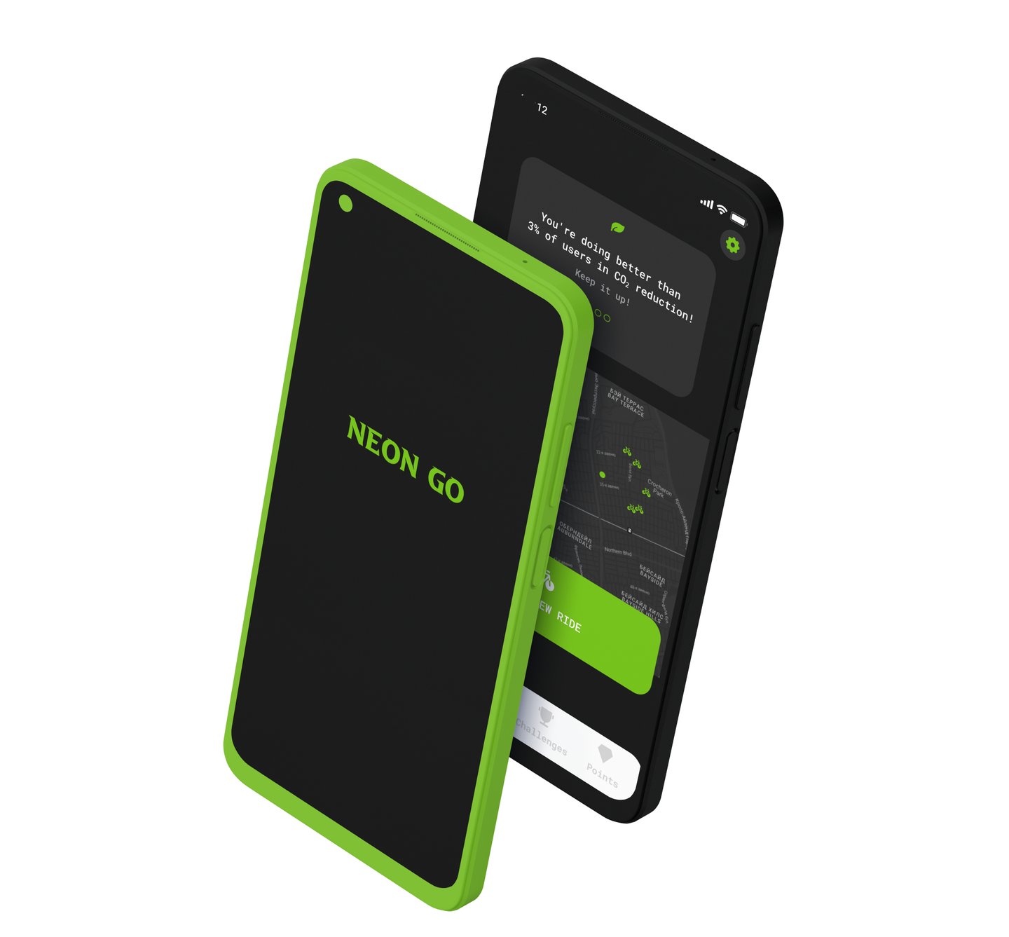
Neon Go is a self-initiated project that encourages users to adopt healthier and more sustainable habits by combining eco-friendly goals with rewards and cost savings.
Target Audience:
Freelancers and gig workers
University students
Beginner and enthusiast cyclists
Environmentally conscious individuals
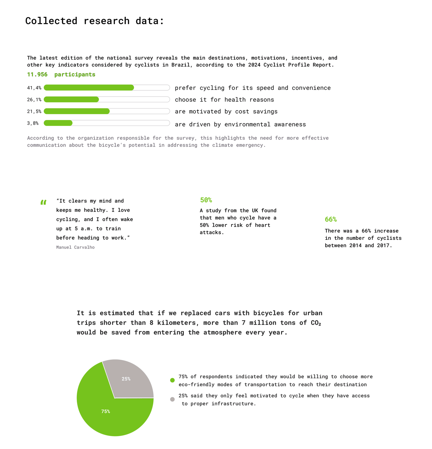
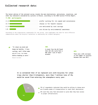
The goal was to gain a deeper understanding of target users and their needs, while identifying behaviors and barriers that hinder the adoption of more sustainable mobility options. I conducted user interviews and performed in-depth secondary research to collect data on sustainable transportation, user behavior, CO₂ emissions, car dependency, and challenges related to public transit.
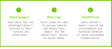
Insights revealed that many users perceive traditional sustainable mobility apps as lacking engaging and immersive experiences. These platforms often fail to consolidate essential features in a single, user-friendly interface. Users are seeking a more practical, intuitive, and mobile-optimized experience that they can access anytime, anywhere. However, many current apps fall short due to confusing navigation, ultimately leading to user frustration.
I transformed research into more human and smarter mobility experiences.
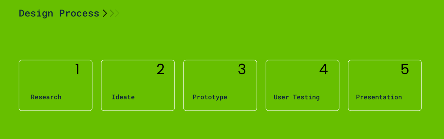
Ideate
Prototype
User Testing
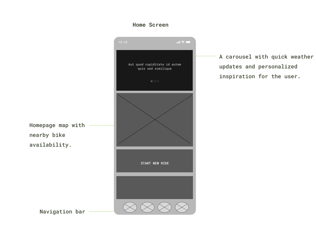
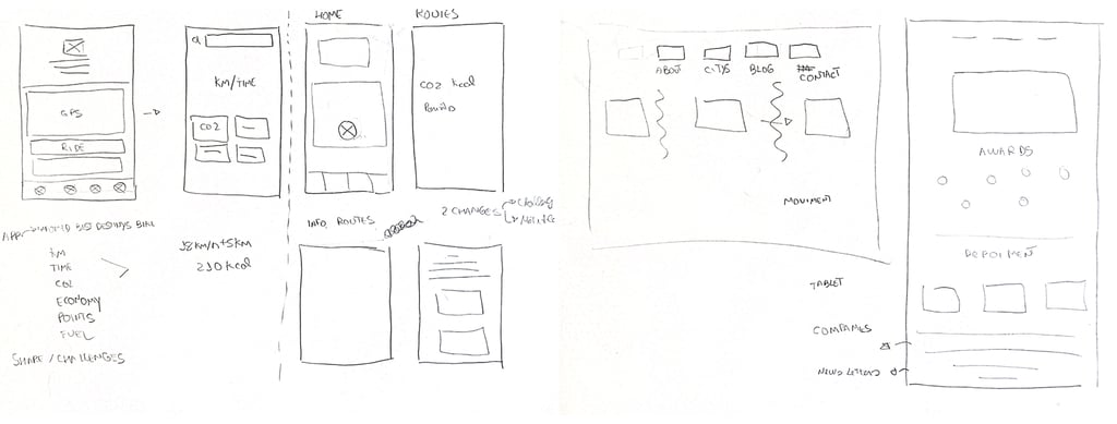
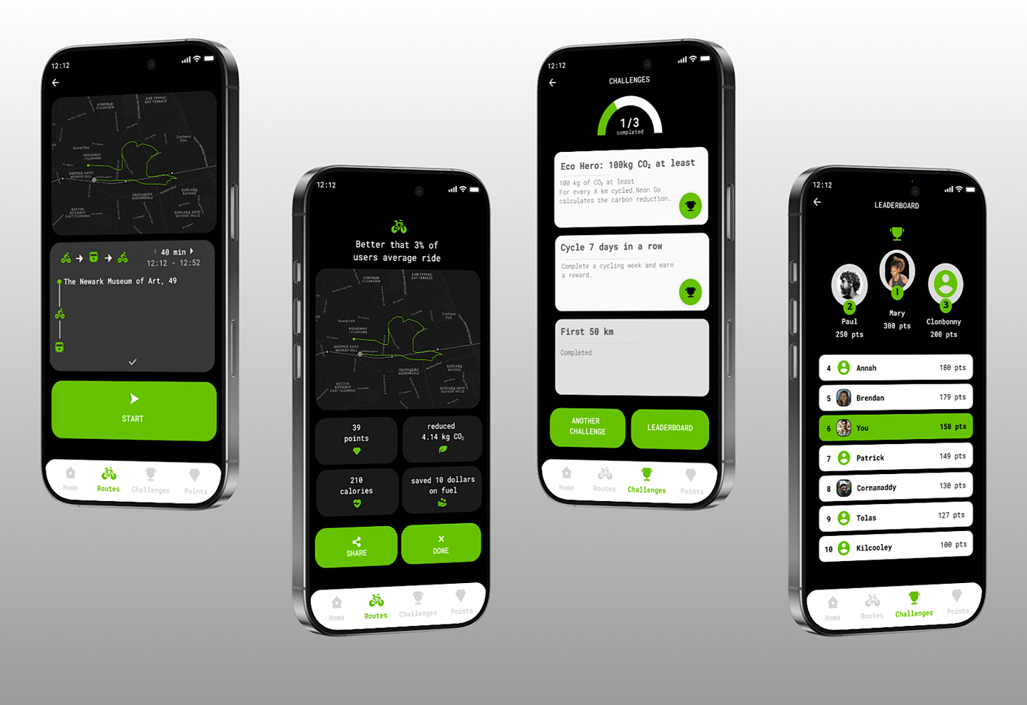
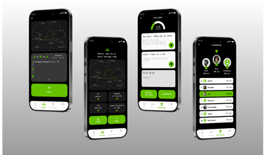
Digital wireframes were developed in Figma to outline the application's structure.
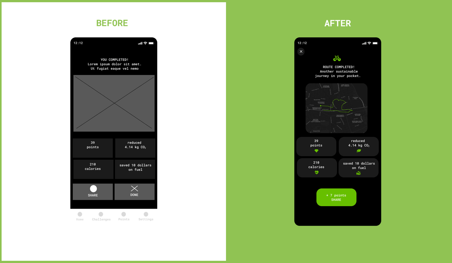

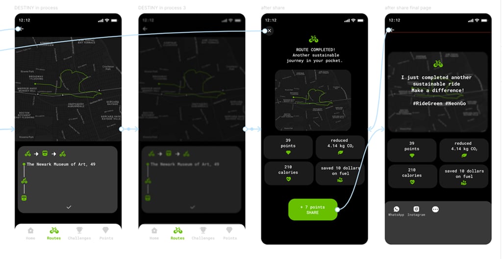
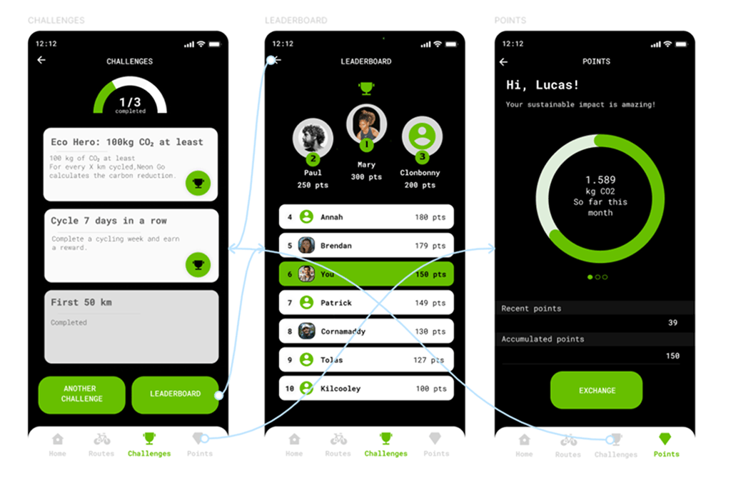
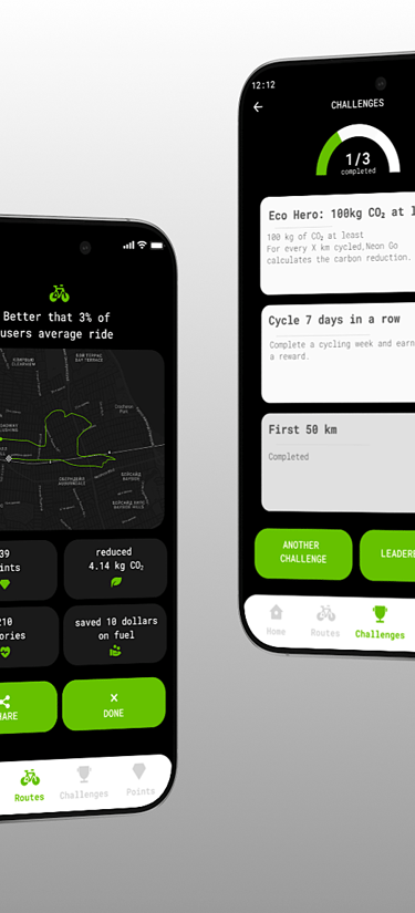
1 - Visually appealing sharing templates were created to encourage usage through small incentives.
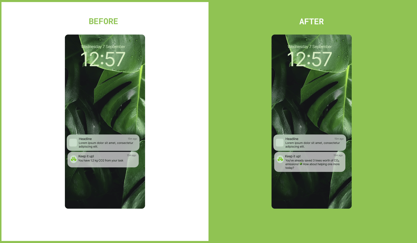
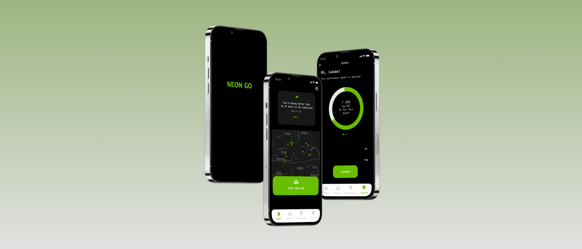
2- To further excite users, more visually impactful dashboards and notifications were created, highlighting CO₂ savings, money saved, and comparisons with car usage.
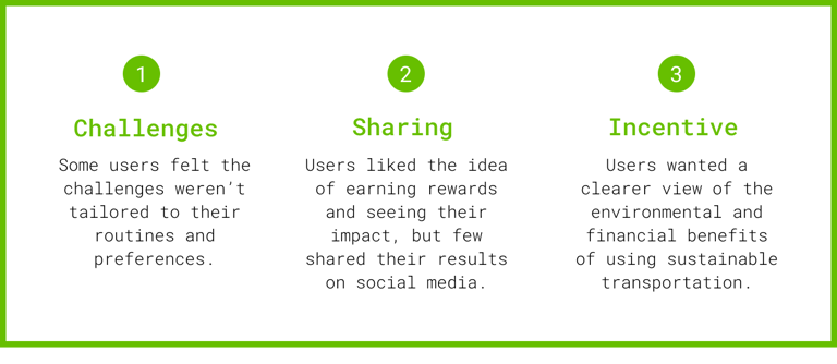
Changes
Findings
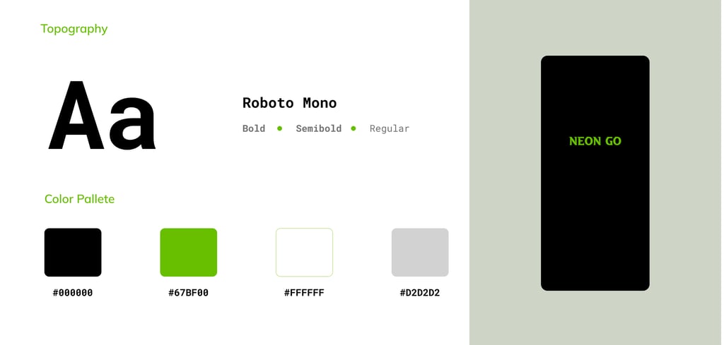
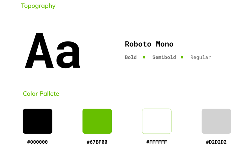
Style Guide

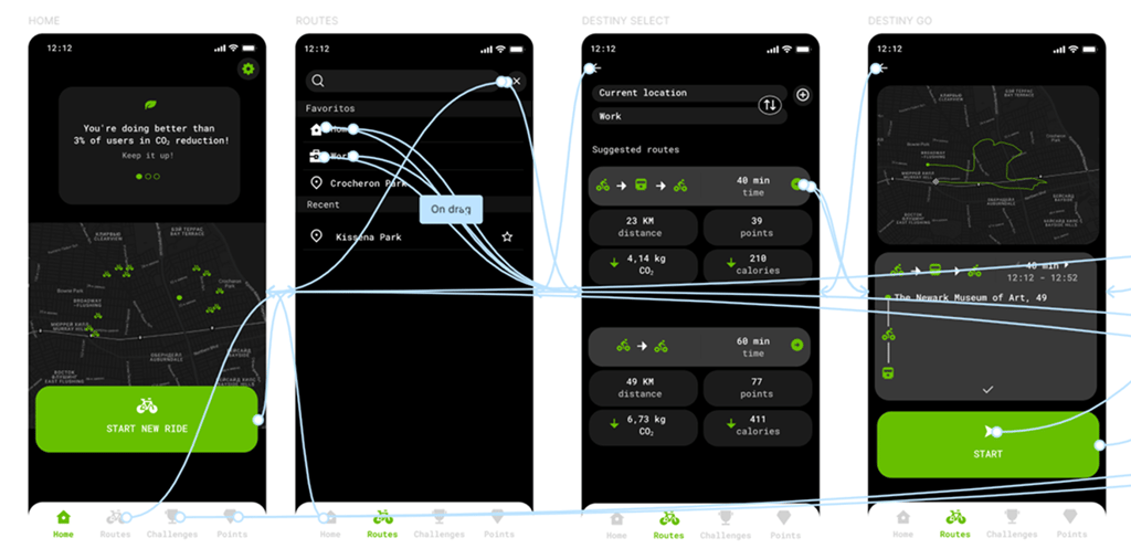
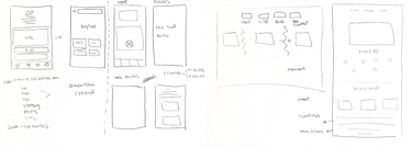
Basic screens were created to illustrate the user journey, and paper wireframes were sketched using the Crazy Eight technique. To bring more insights and understand how the product compares to competitors, a competitive audit was conducted—identifying strengths, weaknesses, opportunities, and market gaps.
Presentation
High-Fidelity Prototype
Style Guide

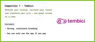
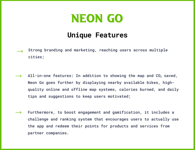
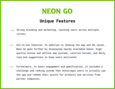
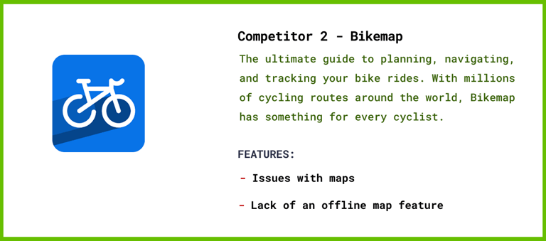
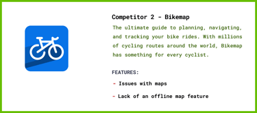
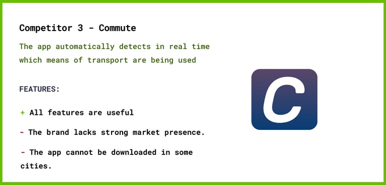
Competitor Analysis

Sketches
My Role:
I did research, conducted user interviews, paper and digital wireframing, low- and high-fidelity prototyping, usability testing, accessibility considerations, design iterations, responsive design, and branding.
Business Challenges:
Limited cycling infrastructure in some cities;
Resistance to changing transport habits;
Safety concerns in traffic;
Difficulty maintaining long-term user engagement;
Inaccurate ride tracking;
Lack of integration with public transport.
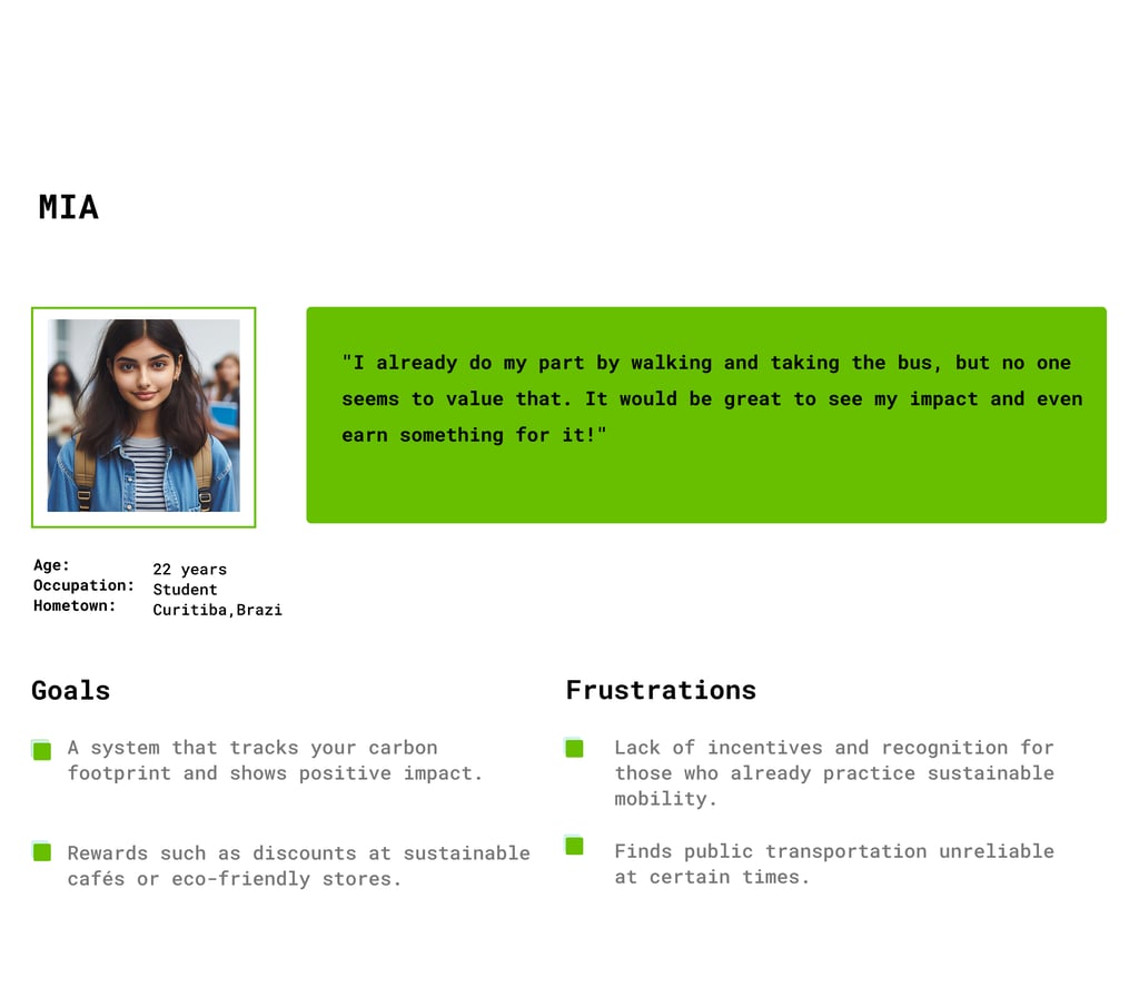
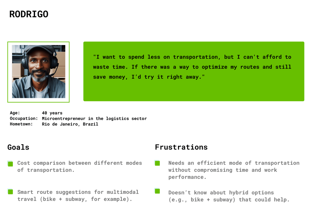
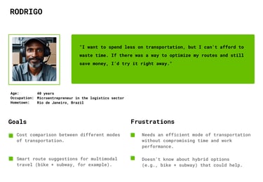
Personas

Personas

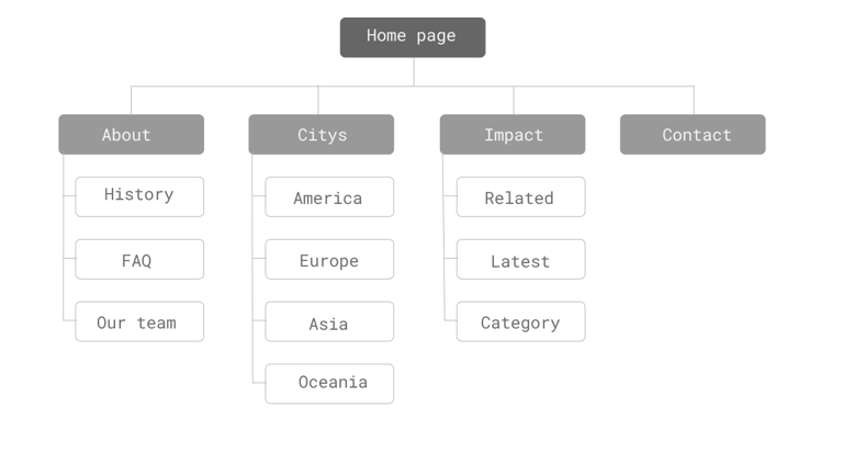
SITEMAP
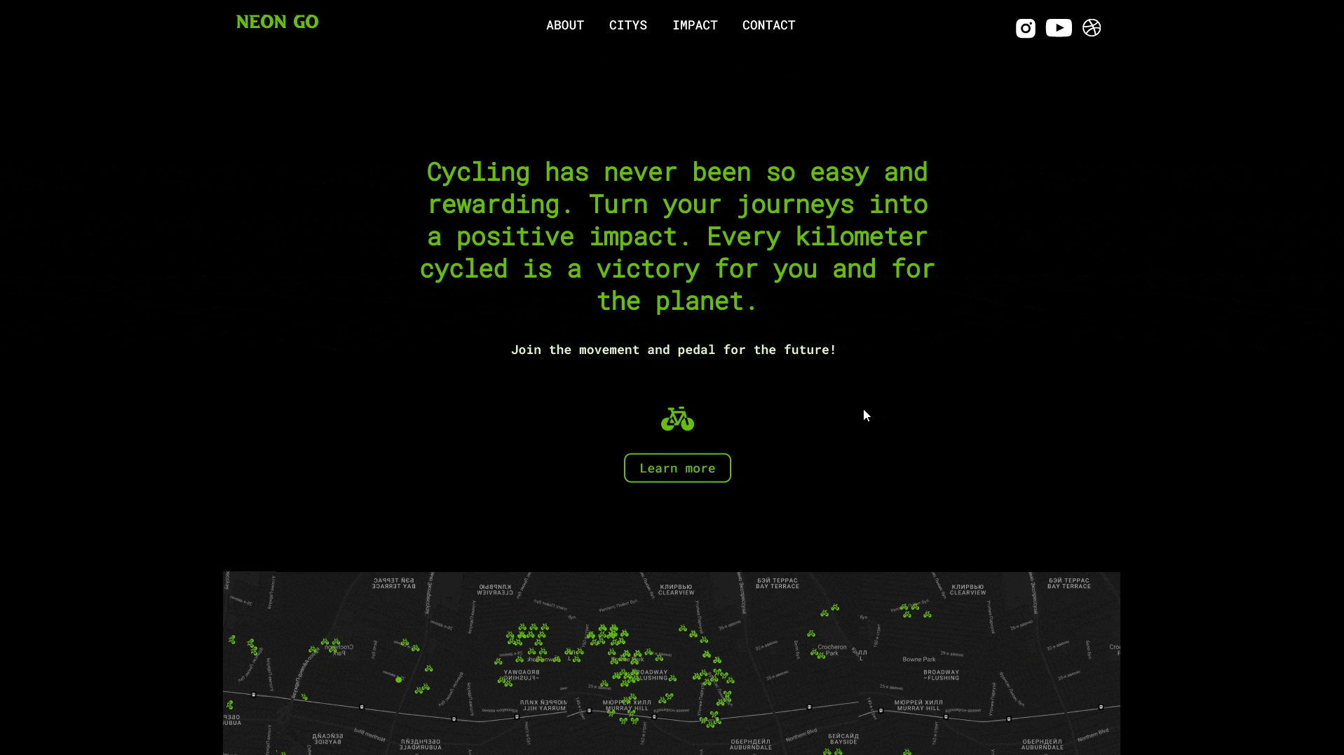
The website was created as an informative platform to increase social media presence and better promote the project.
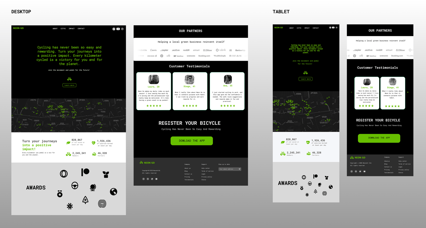
Responsive designs


Takeaways
Impact:
Increased their daily bike usage
Reduced their CO₂ emissions
Felt more motivated to cycle through challenges and rewards
Reported greater awareness about sustainable mobility
What I Learned:
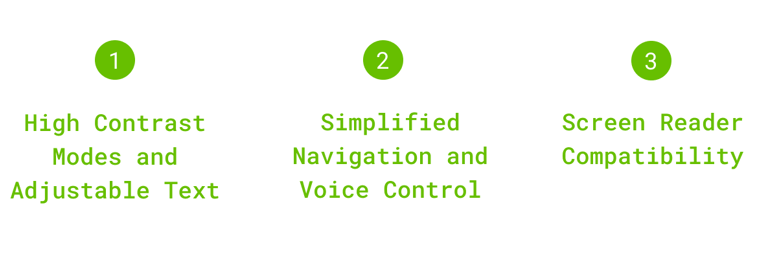
Accessibility should be considered from the start to ensure inclusiveness for all users.
Gamification is a powerful tool for encouraging behavior change.
Usability testing reveals essential details that make the app more intuitive.
Design must balance aesthetics, functionality, and real-world impact.
Community involvement strengthens engagement and retention.